Adaptogen Capital is a private equity firm enabling family office and institutional investors to deploy capital into energy transition assets. The firm was launching into a crowded PE landscape and needed a brand that could establish credibility with institutional audiences from day one.
I started with competitive positioning. Energy transition PE is visually predictable: green gradients, leaf motifs, generic sustainability imagery. I mapped the landscape and identified an opening. The firms that commanded the most trust looked like finance companies, not environmental campaigns. Adaptogen needed to signal scientific rigour and institutional seriousness, not green aspiration.
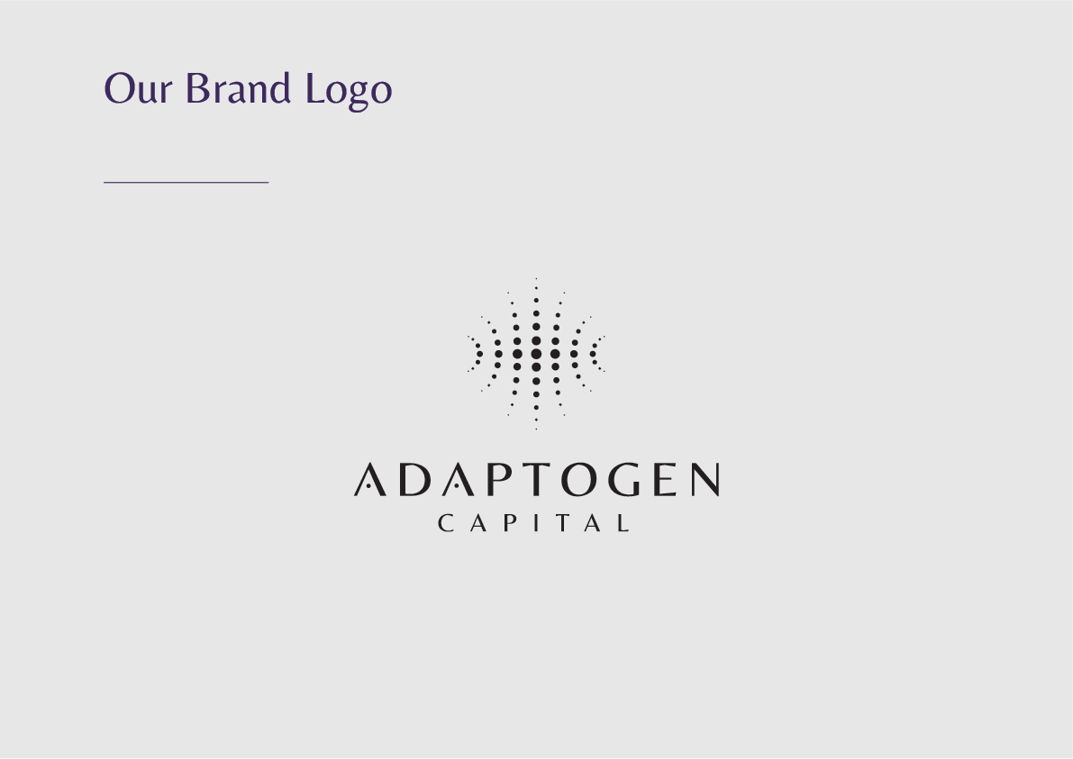
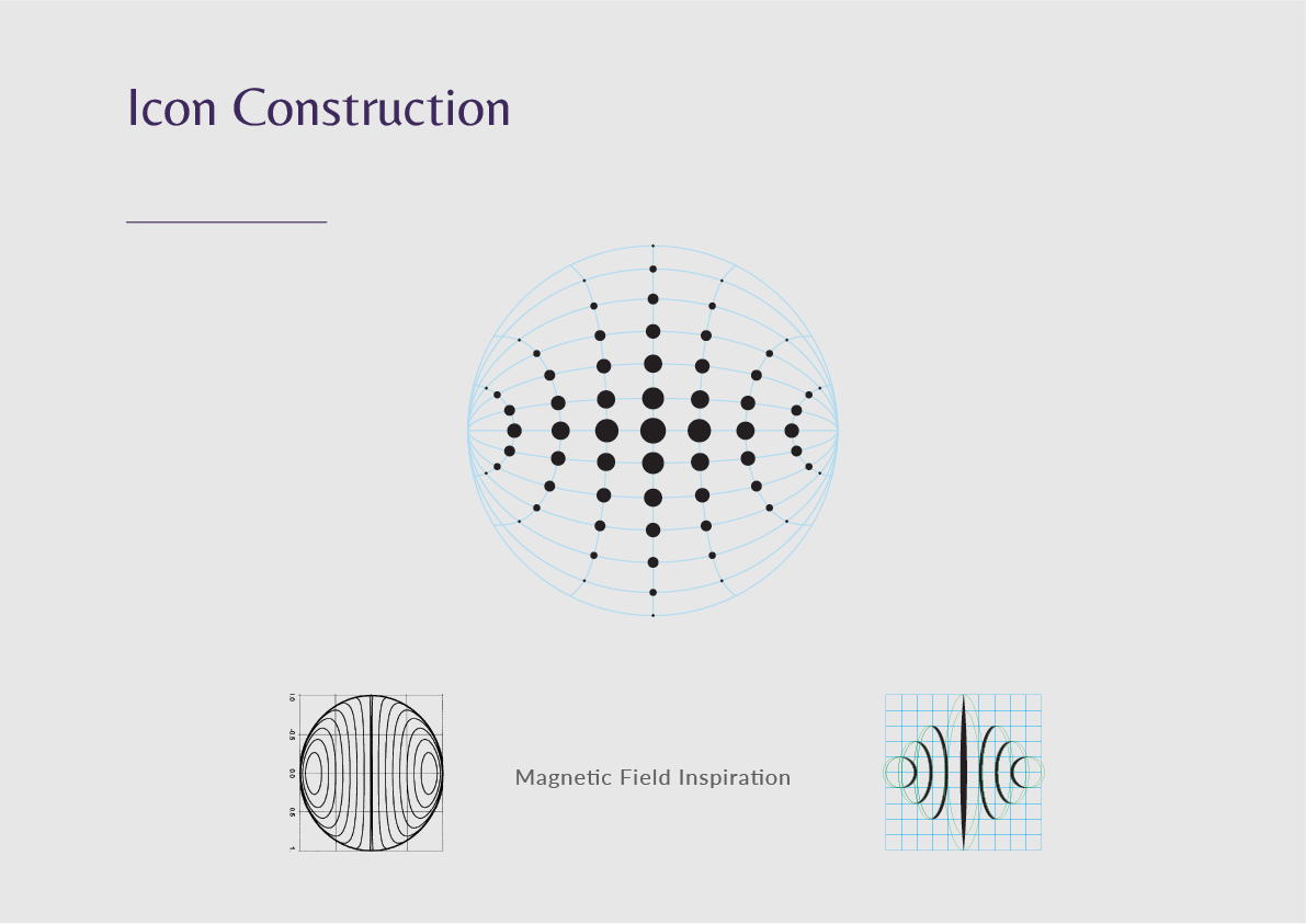
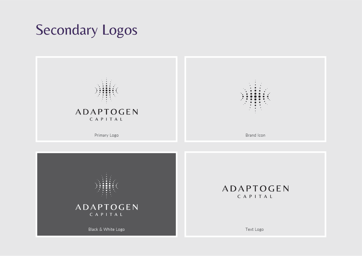
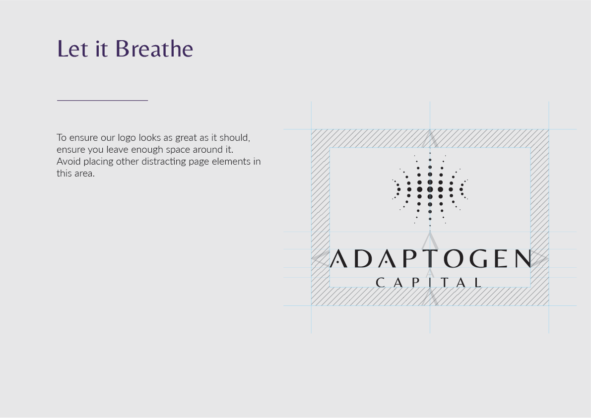
The logomark came from that strategic direction. I drew the icon on a spherical grid derived from electromagnetic field line diagrams, with dot sizes graduated to suggest energy radiating from a central axis. The concept connects energy transition to physics rather than environmentalism — a subtle but deliberate positioning choice that separates the brand from its peers.
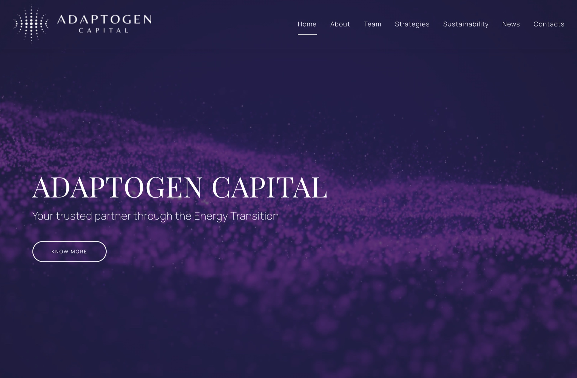
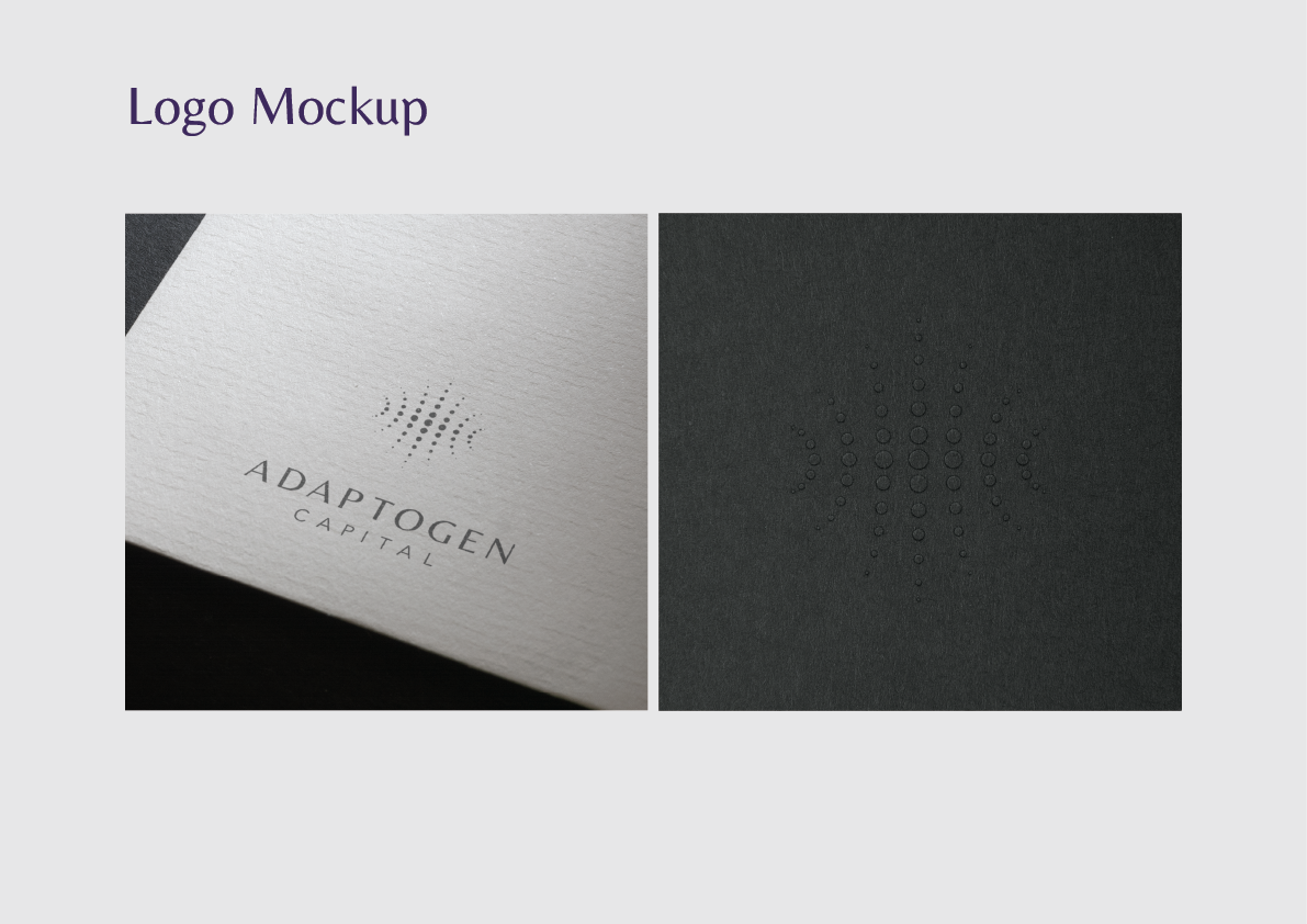
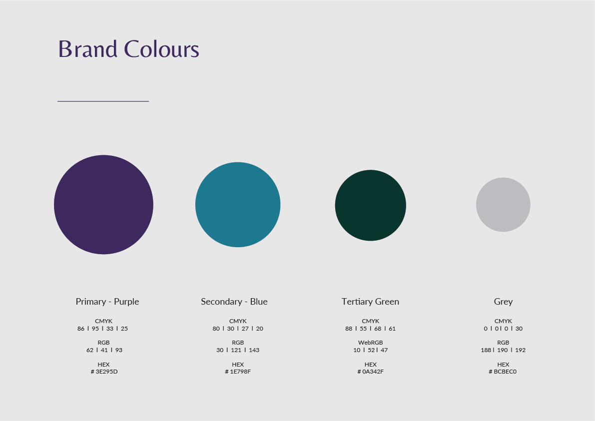
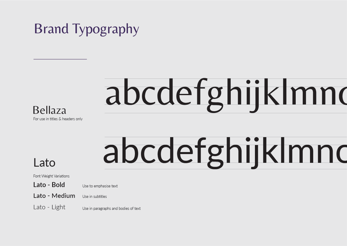
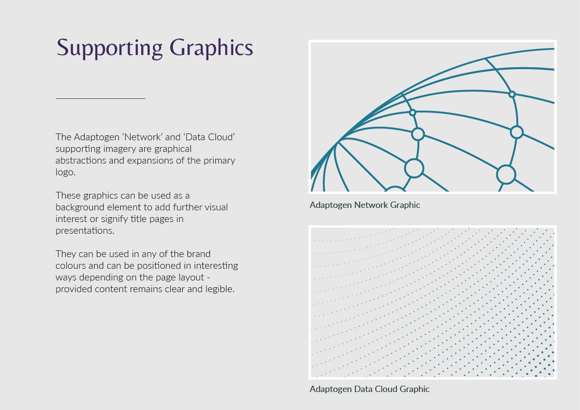
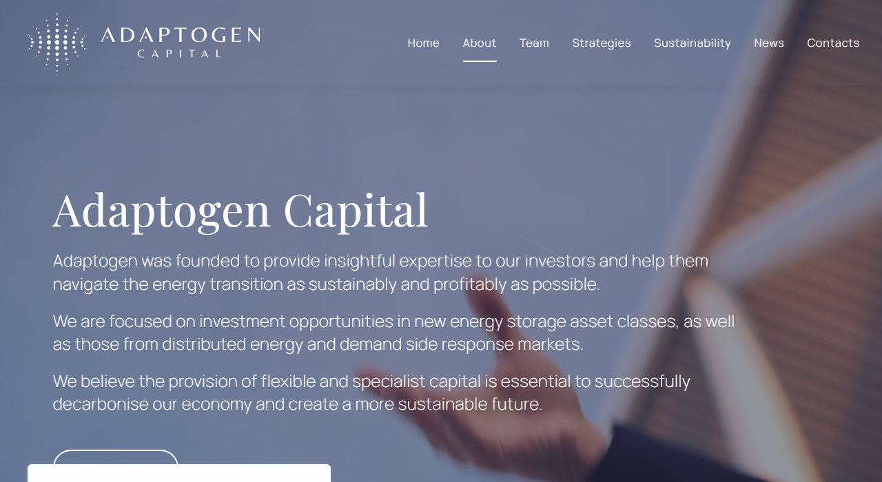
The brand system expanded through stylescapes, refinement rounds, and iterative testing across applications. Guidelines, website, presentation templates, and supporting graphics were all designed as a cohesive system. Each touchpoint reinforces the same positioning: precise, scientific, institutional. The animated website background uses magnetic sand footage — another expression of the field-line concept running through the entire identity.
- Year
- 2020–2021
- Project No.
- 011
- Client
- Adaptogen Capital
- Discipline
- Brand Identity, Brand Guidelines, Website Design, Presentation Design, Motion Graphics
- Role
- Brand Designer
- Production
- Illustrator, Photoshop, After Effects, PowerPoint, Squarespace, InDesign